Saturday, 8 December 2012


These two photographs are my favorite. I love how they took together side by side. 

Tuesday, 23 October 2012


Photography Project 


Lithography


I based my drypoint etches on a car crash. I enjoyed drypoint so much because I loved the process of printing my images and adding slight changes to them whether it was a wash of color in areas, experimenting with college and making each print unique. 


One thing that stood out to me was the issue of 
car crashes on our roads today. I, being a driver, am told every time before I take my car out is "be careful on the roads."Crashes happen all the time and I have some upon the scene of a crash a few times since I started driving 2 years ago. While researching I came upon 2 artists that used car crashes as the main theme for their series of prints. Andy Warhol -"Car crash and disaster series" and Jim dine - "Car crash"

Jim Dine


Jim Dine


Andy Warhol
Andy Warhol


Headlines Project


No matter where we are now-a-days we see headlines whether it is in a newspaper, tabloid magazine, internet or even an advertisement on a billboard. In the 21st Century social media and online news websites have become a popular way of reading what is going on in the world. It is a faster, less expensive and popular way of reading the news especially for the younger generation who don't buy newspapers as much. But do these websites really tell us legitimate news? Well, if your looking to find out the latest news on a celebrity and whats going on in the social media world then yes! 

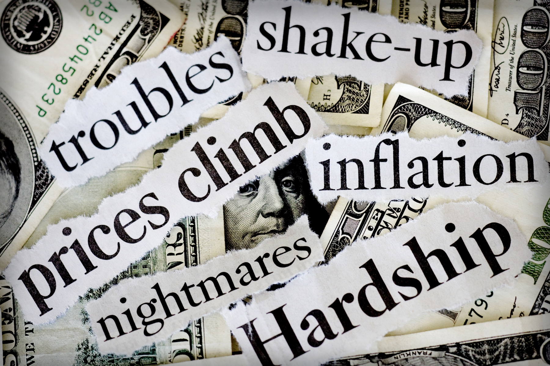
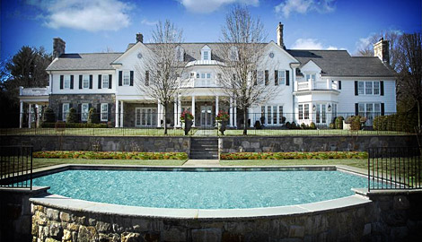
For my project I wanted to look into issues that social media websites and tabloids look at with a blind eye. I feel as if websites like this act like bad things don't happen or maybe they think they are less important than writing about the latest celebrity craze? When researching for the project I looked at things like world disasters, something that is an extremely important issue but one that can be looked at lightly by some. I looked at issues like hurricanes, flash floods, famines, tsunamis, wild fires, poverty, car crashes, recession, government, economy, war. I turned these issues into tabloid news...


War- Celebrity feud


Recession- Forbes rich list


Car Crash- Celebrity crash diet


Poverty- Celebrity buys a house for $10 million 


2nd Year Print!

Monday, 21 May 2012

Artist Statement

A big part of my identity is American. I think being different sets you apart from other people. Whether it is the way you speak, look, dress or your actions. I wanted my prints (collagraph, screenprint and woodcut) to represent my identity as an American. Each print represents an iconic image that each are very personal to me. Weather it is the Brooklyn Bridge that I used to walk across or the Subway station that was my means of transport to everywhere in New York City. I focused on the American Flag in my collagraph prints. I used the original colors, red, white and blue in my print. I then wanted to create my own flag by representing where I am now, and that is Ireland. So I swapped the colors red, white and blue for the colors in the Irish Flag. For my screenprints I chose iconic images. I used bright neon colors in my 'Subway' print because as soon as you step out of the subway station on 42nd street you are hit by the bright lights of Times Square. For my woodcut I chose the #6 subway going to the Brooklyn Bridge. I wanted my woodcut to relate to my screenprint of the Brooklyn Bridge. I feel that I showed my identity through my prints and represented the place I came from.....New York City.

Sunday, 20 May 2012

FINAL WOODCUT


"A subway ride to the Brooklyn Bridge" 


Here is my final woodcut print. It is a print of a moving no. 6 subway train going to the brooklyn bridge (which i wanted to tie in with my previous screen print of the brooklyn bridge)

I originally had 2 layers of color, red and blue.... but I thought the print needed something extra so I tested a few colors on some test prints and decided that adding a final 3rd layer of yellow ink that I mixed in with some transparency.
Printing Press's

Drying Rack

Ink

Roller

Here I was testing out ink's and colors that I was planning to use for my print

Here are some examples of woodcuts... (some have a New York theme) 


woodcut printed on rice paper


Japanese Printmaker that I admire:

Houksai

Famous woodcut-  "The Great Wave of Kanagawa" 

The Great Wave or simply The Wave, is a woodblock by the Japanese artist Hokusai. An example of ukiyo-e art, it was published sometime between 1830 and 1833

Mount Fuji

"Pink and Red Peonies Blown to the Left in a Breeze and a Butterfly"


Woodcut is a relief printing artistic technique in printmaking in which an image is carved into the surface of a block of wood, with the printing parts remaining level with the surface while the non-printing parts are removed, typically with gouges. The areas to show 'white' are cut away with a knife or chisel, leaving the characters or image to show in 'black' at the original surface level. The block is cut along the grain of the wood. The surface is covered with ink by rolling over the surface with an ink-covered roller, leaving ink upon the flat surface but not in the non-printing areas. Multiple colors can be printed.
WOODCUT

FINAL "BROOKLYN BIRDGE" PRINT


I used three layers for this print. I started with a light blue, then I used a grey and concluded with a black to add shadows and depth to my print. 


FINAL "SUBWAY" PRINT


1st Layer (neon pink)
2nd Layer (neon blue)

I decided to use very bright neon colors because when i think of getting off the subway at 42nd street Times square I think of bright lights and lots of bright colors